Something truly monumental happened in the world of software development in 2025. Safari shipped a
reasonable implementation of text-wrap: pretty:
https://webkit.org/blog/16547/better-typography-with-text-wrap-pretty/. We are getting
closer and closer to the cutting-edge XV-century technology. Beautiful paragraphs!
We are not quite there yet, hence the present bug report.
A naive way to break text into lines to form a paragraph of a given width is greediness: add the
next word to the current line if it fits, otherwise start a new line. The result is unlikely to be
pretty — sometimes it makes sense to try to squeeze one more word on a line to make the lines more
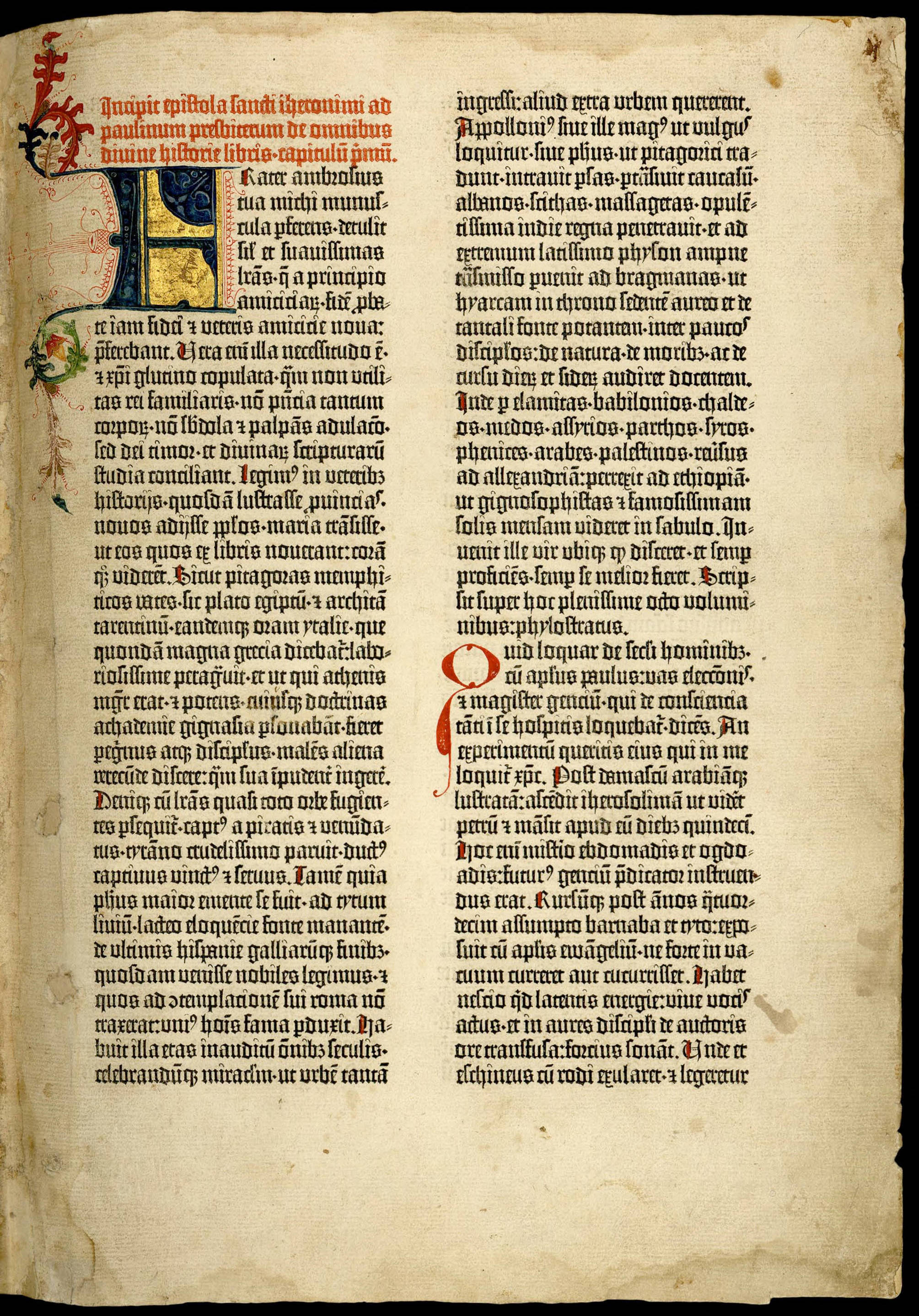
balanced overall. Johannes Gutenberg did this sort of thing manually, to produce a beautiful page
above. In 1981, Knuth and Plass figured out a way to teach computers to do this, using dynamic
programming, for line breaking in TeX.
Inexplicably, until 2025, browsers stuck with the naive greedy algorithm, subjecting generations of
web users to ugly typography. To be fair, the problem in a browser is harder version than the one
solved by Gutenberg, Plass, and Knuth. In print, the size of the page is fixed, so you can compute
optimal line breaking once, offline. In the web context, the window width is arbitrary and even
changes dynamically, so the line-breaking has to be “online”. On the other hand, XXI century
browsers have a bit more compute resources than we had in 1980 or even 1450!
Making lines approximately equal in terms of number of characters is only half-way through towards a
beautiful paragraph. No matter how you try, the length won’t be exactly the same, so, if you want
both the left and the right edges of the page to be aligned, you also need to fudge the spaces
between the words a bit. In CSS,
text-wrap: pretty
asks the browser to select line breaks in an intelligent way to make lines roughly equal, and
text-align: justify
adjusts whitespace to make them equal exactly.
Although Safari is the first browser to ship a non-joke implementation of text-wrap, the
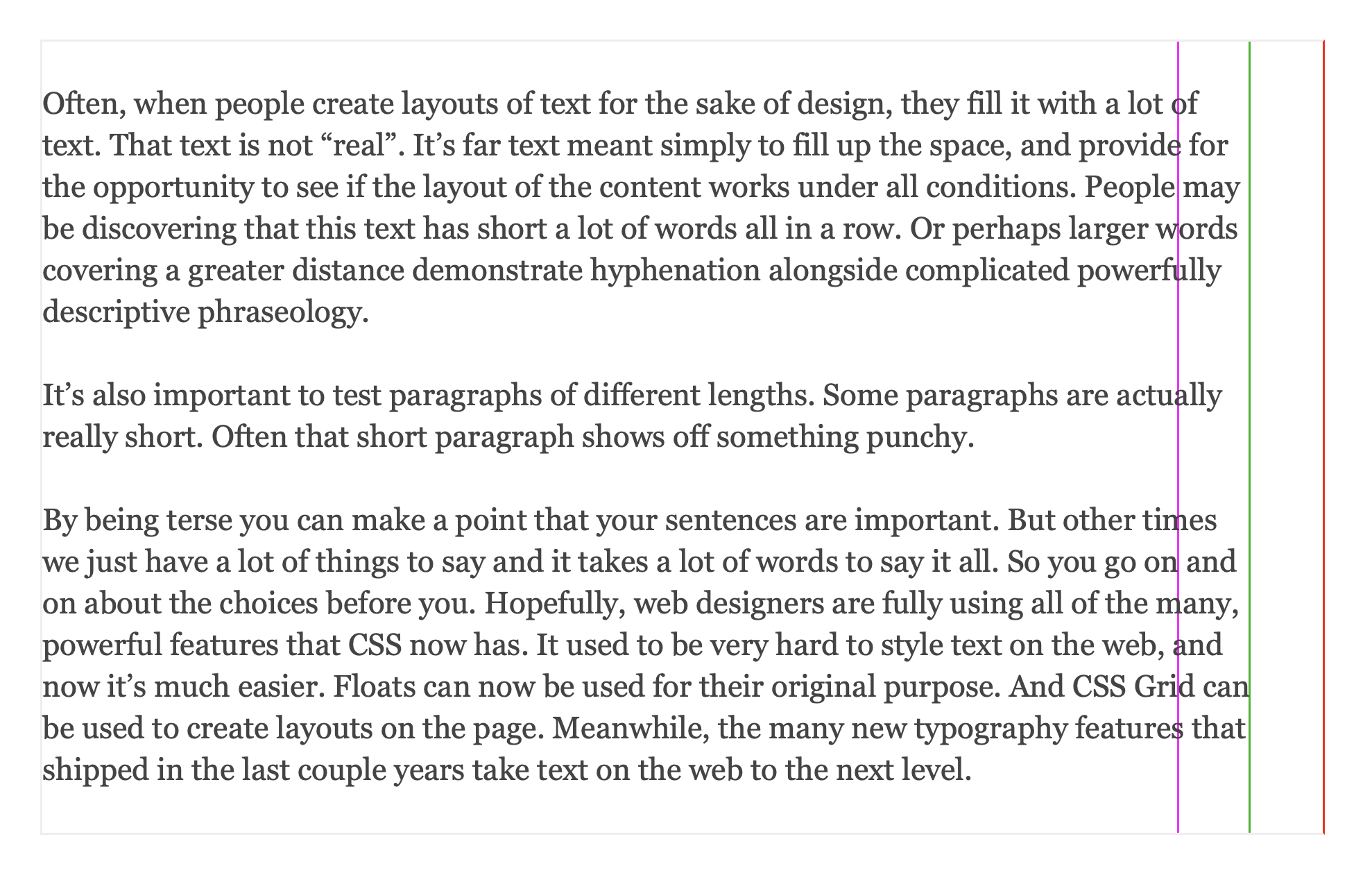
combination with text-align looks ugly, as you can see in this very blog post. To pin the ugliness
down, the whitespace between the words is blown out of proportion. Here’s the same justified
paragraph with and without text-wrap: pretty:
The paragraph happens to look ok with greedy line-breaking. But the “smart” algorithm decides to add
an entire line to it, which requires inflating all the white space proportionally. By itself, either
of
p { text-wrap: pretty;text-align: justify;}
looks alright. It’s just the combination of the two that is broken.
This behavior is a natural consequence of implementation. My understanding is that the dynamic
programming scoring function aims to get each line close to the target width, and is penalized for
deviations. Crucially, the actual max width of a paragraph is fixed: while a line can be arbitrary
shorter, it can’t be any longer, otherwise it’ll overflow. For this reason, the dynamic programming
sets the target width to be a touch narrower than the paragraph. That way, it’s possible to both
under and overshoot, leading to better balance overall. As per
original article:
The browser aims to wrap each line sooner than the maximum limit of the text box. It wraps
within the range, definitely after the magenta line, and definitely before the red line.
But if you subsequently justify all the way to the red line, the systematic overshoot will manifest
itself as too wide inter-word space!
WebKit devs, you are awesome for shipping this feature ahead of everyone else, please fix this small
wrinkle such that I can make my blog look the way I had intended all along ;-)